
 Español
March 20th, 2020
The scale of inequality in the world is staggering. In 2018, the average inhabitant of Denmark, Norway, Sweden, Iceland, and Ireland earned more in two days than what the average inhabitant of Malawi and Burundi earned during an entire year [1].
However, the inequality within some countries is even bigger than the inequality between countries. As we show in the upcoming Municipal Atlas of the SDGs in Bolivia, there are larger differences in the Sustainable Development Index between municipalities within Bolivia than there are between all the countries in the world. This means that within Bolivia we find municipalities with levels of development similar to the most advanced countries in the World, but also municipalities similar to some of the least developed countries in the World.
In addition to this astounding inequality between municipalities within Bolivia, there are also huge inequalities within each municipality, and that is what we focus on in this blog.
Measuring inequality at the sub-national level is difficult, because it requires income/consumption data that is representative at the municipal level, and this is neither available from household surveys nor population censuses. We get around this problem by using data on electricity consumption by each household in Bolivia, under the assumption that electricity consumption in each household is a reliable predictor of general consumption/income/welfare in the household. The analysis was made possible due to a research project sponsored by the Centre for Social Research (CIS) of the Bolivian Vice-presidency [2].
The CIS project calculated Gini coefficients of electricity consumption to estimate the level of inequality within each municipality. Figure 1 shows two examples. To the left is the Lorenz curve and the Gini coefficient for a big urban municipality, Santa Cruz de la Sierra. To the right is the Lorenz curve and Gini coefficient for a poor rural municipality, Tinguipaya, with low electricity coverage and low electricity consumption for the ones that actually do have access to the electricity grid.
Figure 1: Examples of electricity consumption Lorenz curves, 2016
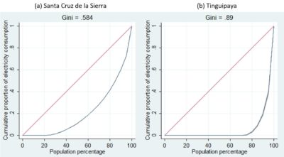
Source: Andersen, Branisa y Guzman (2019) [2].
According to these Lorenz curves, the big, urban municipality of Santa Cruz de la Sierra is clearly more equal in electricity consumption (and thus likely consumption in general) than the small, rural municipality of Tinguipaya, as the Lorenz curve of the former is much closer to the diagonal line of perfect equality.
Indeed, as can be seen in Figure 2, this is the general tendency across all municipalities in Bolivia. Urban municipalities tend to have lower levels of poverty (poverty being measured as extremely low electricity consumption) and lower levels of inequality (as measured by the Gini coefficient of electricity consumption).
Figure 2: Energy inequalty versus energy poverty in Bolivian municipalities, 2016
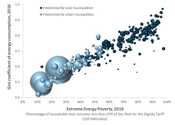 Source: Authors’ elaboration based on data from Andersen, Branisa y Guzman (2019).
This strong positive correlation between energy poverty and energy inequality seems suspicious, and perhaps even counter-intuitive. Consider this extreme hypothetical example: If all households in a municipality had zero electricity consumption, except the mayor, who had a moderate electricity consumption covering a few light bulbs and a refrigerator, then the Gini coefficient would be 0.99, suggesting extremely high inequality in the municipality, whereas common sense would suggest that the population is very equal in their extremely high level of poverty.
The Gini coefficient is by far the most widely used measure of inequality, and easy to interpret, so it was the logical metric to use. But these results made us wonder if the Gini coefficient tends to confound extreme poverty with extreme inequality.
Thus, in this blog we set out to explore whether there are alternative measures of inequality that might correspond better to intuition. There are surprisingly many different measures of inequality, so it became another long post.
There are four basic principles that one would expect from an inequality measure [3]:
- Symmetry (or anonymity): If two people switch incomes, the index level should not change.
- Population invariance (or replication invariance): If the population is replicated or “cloned” one or more times, the index level should not change.
- Scale invariance (or mean independence): If all incomes are scaled up or down by a common factor (for example, doubled), the index level should not change.
- The Pigou-Dalton Transfer Principle: If income is transferred from one person to another who is richer, the index level should increase. In other words, in the face of a regressive transfer, the index level must rise.
It can be shown that the Gini coefficient satisfies these four basic principles, as does several other inequality measures, such as the Atkinson Index, the Theil entropy measure, and the Theil mean log deviation measure. These inequality measures are all called strongly Lorenz-consistent [4].
Some frequently used inequality measures are only weakly Lorenz-consistent, however, as they do not fully comply with the fourth principle. When a poorer person makes a transfer to a richer person, the inequality indicator need not rise, but at least it should not fall [4]. The Palma ratio (the income of the 10% richest divided by the income of the 40% poorest) and other Kuznets ratios (X% richest/Y% poorest) are only weakly Lorenz-consistent.
Other inequality measures are plainly Lorenz-inconsistent. This is the case for quantile ratios (p90/p10, p75/p25, etc.) and the Variance of Logarithms. For both of these measures it is possible that a regressive transfer from a poorer person to a richer person would cause a fall in the inequality measure, which is clearly counter intuitive [4]. The Absolute Gini proposed by Jason Hickel [5] is even worse, as it also violates the third principle of scale invariance.
From the theoretical arguments mentioned above, we would expect all the Lorenz-consistent measures to yield pretty much the same results as the Gini coefficient, so we decided to also include weakly Lorenz-consistent and Lorenz-inconsistent measures in our comparisons.
However, we quickly ran into an important problem: Many inequality measures cannot handle zero values (e.g. Theil, Atkinson, percentile ratios). Some algorithms circumvent this problem simply by ignoring zero values. But we do not consider this a reasonable strategy, since the lack of access to electricity is one of the fundamental problems we want to highlight rather than ignore. An alternative way around this problem is simply to add a small value, for example 1 kWh per year, to all observations, which does not change overall patterns, but will make all computational algorithms work [6].
During the following sections, we will compare many different inequality measures with the Gini coefficient. All inequality measures are calculated on household level data on annual electricity consumption + 1 kWh for a selection of 25 municipalities that span the whole range shown in Figure 2. For each of the alternative inequality measures we discuss the intuition behind the measure, its advantages and disadvantages, and show its relationship to the Gini coefficient.
Atkinson Indices
The Atkinson Index, A(e), is actually a whole class of inequality measures, differentiated by a parameter, e, that measures the degree of inequality aversion. When e = 0, there is no aversion to inequality, and A(0) = 0. When e = ∞, there is infinite aversion to inequality and A(∞) = 1. The Atkinson Index thus varies between 0 and 1, like the Gini coefficient, which facilitates interpretation. The Atkinson Index has the advantage of being sub-group decomposable, which the Gini coefficient is not.
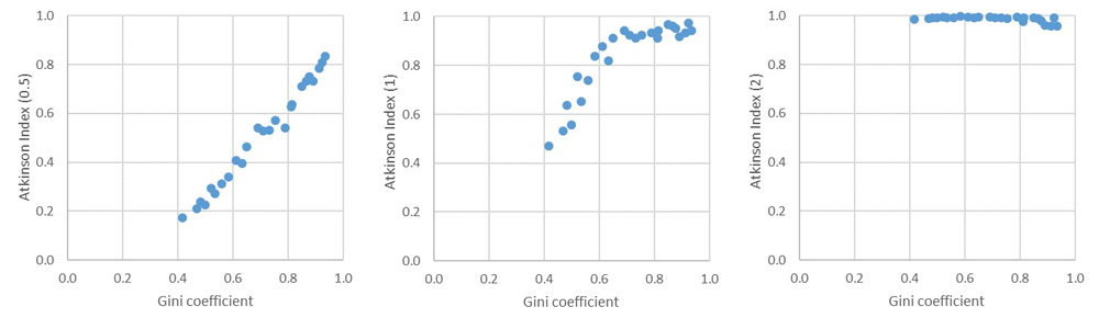
The Stata package ineqdeco (created by Stephen P. Jenkins at London School of Economics) calculates the Atkinson Index for three different parameters: 0.5, 1 and 2. Figure 3 shows how the Gini coefficient (of annual electricity consumption + 1 kWh) compares to these three Atkinson Indices.
Figure 3: Comparing the Gini coefficient with three Atkinson Indices for a sample of 25 municipalities
 Source: Authors’ elaboration.
We see that for moderate inequality aversion (e = 0.5), the Atkinson Index behaves very similarly to the Gini coefficient. For stronger inequality aversion (e = 1), the Atkinson index increases at all levels, but especially for the ones that had high Gini coefficients, thus exaggerating the counter-intuitive results of the Gini coefficient. For very high inequality aversion (e = 2), the Atkinson Index is very close to maximum for all our municipalities, and thus do not provide any useful information about differences in inequality.
In conclusion, the A(0.5) index seems the most useful of the three, but it behaves very much like the Gini coefficient and thus does not solve our initial problem of counter-intuitive results.
Generalized Entropy Indices (including mean log deviation and Theil index)
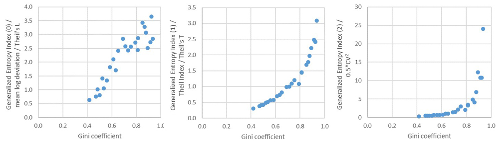
The Generalized Entropy Index, GE(α), is another class of inequality measures. As with the Atkinson Indices, the GE Indices involve a parameter, α, that can shift the sensitivity to different parts of the distribution. For lower values of α, GE is more sensitive to differences in the lower tail of the distribution, and for higher values GE is more sensitive to differences that affect the upper tail. The most common values of α used are 0, 1 and 2 [7].
The GE Index has several other inequality metrics as special cases. For example, GE(0) is the mean log deviation (also sometimes called Theil’s L), GE(1) is the Theil index, or Theil’s T, and GE(2) is half the squared Coefficient of Variation.
The values of GE indices can vary between 0 and ∞, with zero representing an equal distribution and higher value representing a higher level of inequality.
Like the Atkinson Index, the GE Index is decomposable, which is an advantage over the Gini coefficient. However, it is not bounded above, and the interpretation is not at all intuitive.
The Stata package ineqdeco calculates several different GE Indices. Figure 4 shows how the Gini coefficient (of annual electricity consumption + 1 kWh) compares to the three most common ones.
Figure 4: Comparing the Gini coefficient with the three most common
Generalized Entropy Indices for a sample of 25 municipalities
Source: Authors’ elaboration.
In all three cases the GE indices agree with the Gini coefficient that the poorest municipalities with the highest Gini coefficients have the highest levels of inequality. The GE(0) index moderates the relationship slightly, whereas the GE(1) exaggerates it, and the GE(2) exaggerates it even more. Thus, none of the three most commonly used GE indices suggests that poorer municipalities would be more equal.
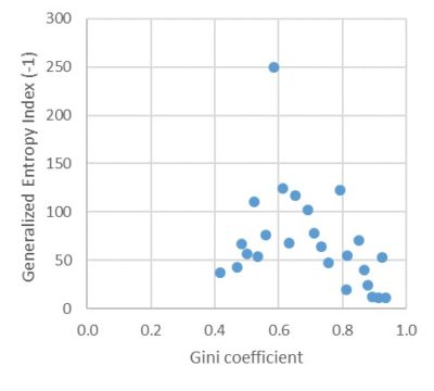
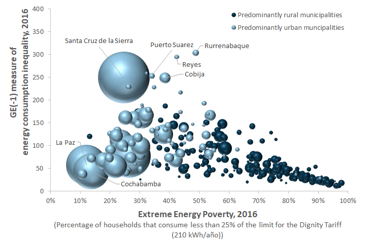
However, α can also take on negative values, making it more sensitive to differences in the lower end of the distribution. Figure 5 shows that the GE(-1) index is completely different from the Gini coefficient. One municipality that stands out with extremely high inequality (GE(-1) = 250) is Santa Cruz de la Sierra (Bolivia’s most populous municipality, home to both extremely rich and extremely poor households), whereas the poorer municipalities in our sample have the lowest levels of inequality according to this measure (still high, though, as the scale is completely different for this GE measure).
Figure 5: Comparing the Gini coefficient with the GE(-1) index for a sample of 25 municipalities
Source: Authors’ elaboration.
This rarely used inequality measure, GE(-1), potentially fits better with common intuition about which municipalities are more unequal. We will explore it in more detail further below.
Income shares, Kuznets ratios and Palma ratio
Thomas Piketty’s best-selling book “Capital in the Twenty-First Century” made the use of percentile shares popular for analyzing inequality. Piketty and collaborators focused on top-percentage shares, using varying percentages as thresholds (top 10%, top 1%, top 0.1%, etc.).
A related concept is the Kuznets ratio, which compares the income of the top X% with the bottom Y% of the population. A special case of this is the Palma ratio (the income of the 10% richest divided by the income of the 40% poorest) (8). The top-percentage shares are a special case of Kuznets ratio, as it is the top X% divided by the bottom 100%. So all these measures can be called Kuznets ratios.
Kuznets ratios are weakly Lorenz-consistent, since progressive or regressive transfers within each group analyzed will not affect the various indicators.
Ben Jann of the University of Bern created a convenient Stata command, pshare, to calculate the share of income received by any group along the income distribution [9]. The default is the income shares of the five quintiles (20% poorest to 20% richest). However, due to the high level of inequality in electricity consumption indicated by the Gini coefficient, we find it important to disaggregate the top quintile, and see the share of electricity consumed by the top 10%, top 5% and top 1% of households in each municipality.
In addition, in order to calculate the Palma ratio, we use the 40% and 90% cut-offs.
Figure 6 shows how the Gini coefficient (of annual electricity consumption + 1 kWh) compares to the following three Kuznets ratios: Top 5% of electricity consumption share; top 1% share; and the Palma ratio.
Figure 6: Comparing the Gini coefficient with three Kuznets ratios
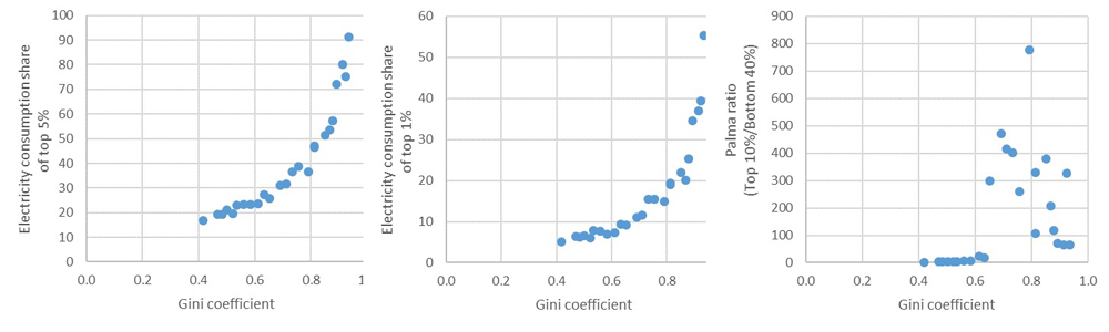
Source: Authors’ elaboration.
The first two measures, which focus on the top end of the distribution, confirms -and even exaggerates- the finding that the poorest municipalities are the most unequal.
However, the Palma ratio shows a completely different pattern. The extreme outlier in our small sample is Uyuni, with a Palma ratio of 777, followed by Ixiamas, Machacamarca and Patacamaya. In contrast, all the mayor cities of Bolivia have very low levels of inequality by this measure. There is nothing about these results that seems even remotely related to intuition.
In the range of Gini coefficients between 0.4 and 0.63, there seem to be a positive relationship with the Palma ratio, but for higher Gini’s the relationship becomes completely random and unrelated to common sense.
Other inequality measures
There are several standard measures of dispersion reported by statistical packages, but which do not have fancy names nor particularly intuitive interpretations, and thus are not widely used in the inequality literature.
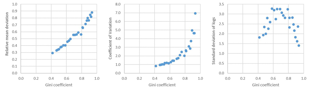
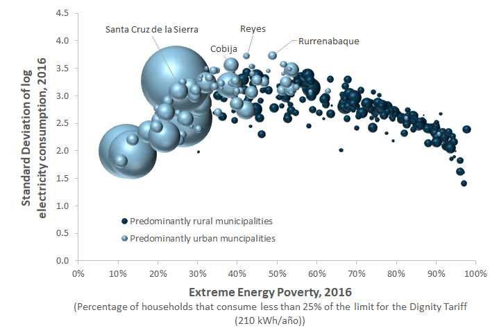
The first three indicators reported by the Stata command inequal (developed by Edward Whitehouse of OECD in Paris), are the Relative Mean Deviation (RMD), the Coefficient of Variation (CV) and the Standard Deviation of Logs (SDL). Figure 7 plots these inequality measures against the Gini for our sample of 25 municipalities.
Figure 7: Comparing RMD, CV, and SDL to the Gini coefficient
Source: Authors’ elaboration.
The first of these measures, RMD, are closely related to the Gini coefficient; the second one, CV, exaggerates the relationship between inequality and poverty, but the third paints a different picture that might possibly correspond better to intuition. According to the bland indicator called “Standard Deviation of logs”, Santa Cruz de la Sierra has high inequality, while Poroma (one of the poorest municipalities in Bolivia) has low inequality, which seem to correspond to intuition.
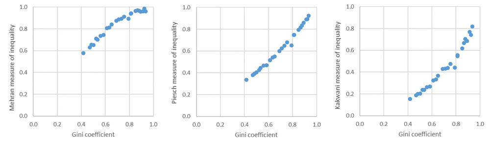
The same inequal Stata command reports the Mehran, Piesch and Kakwani measures of inequality. They are not well known, nor widely used, and since they all correlate strongly with the Gini coefficient (see Figure 8), we don´t think they provide much additional insights into inequality within Bolivian municipalities.
Figure 8: Comparing Mehran, Piesch and Kakwani to the Gini coefficient
 Source: Authors’ elaboration.
Conclusions
In this blog we have investigated the properties of 16 alternative measures to the Gini coefficient of inequality. Most of them agree with the Gini coefficient that poor, rural municipalities are more unequal than rich, urban municipalities.
However, we found two inequality measure that provide different, yet plausible patterns of inequality. Those are the Standard Deviation of logs and the Generalized Entropy Index with a parameter of -1 (strong emphasis on the lower end of the distribution).
Since the results seemed intuitive for our sample of 25 municipalities, we decided to crunch the numbers for all 339 municipalities. Figure 9 shows how Figure 2 would look if we use GE(-1) instead of the Gini coefficient. And Figure 10 shows the same, but using the Standard Deviation of logs measure instead.
Figure 9: Comparing poverty and inequality using GE(-1) for all municipalities in Bolivia
Source: Authors’ elaboration.
Figure 10: Comparing poverty and inequality using Standard Deviation of logs for all municipalities in Bolivia
Source: Authors’ elaboration.
It is interesting to note that the two measures GE(-1) and Standard Deviation of logs agree on many of the most unequal municipalities (e.g. Rurrenabaque, Reyes, Cobija, Santa Cruz de la Sierra, Puerto Suarez), while they completely disagree with the Gini coefficient about the high level of inequality in small, poor, completely rural municipalities. Both are in reasonable agreement concerning the relative rankings of the large urban municipalities, with all agreeing that Cochabamba is the most equal of the 10 capital cities (+ El Alto) and Cobija the most unequal. The correlation between the two is 0.83, which is high, but not so high as to be redundant.
Of the 17 different ways to measure inequality that we have tried out in this blog, GE(-1) and Standard Deviation of logs seem to correspond best to intuition about inequality within Bolivian municipalities. The Gini coefficient, and all the other measures that correlate strongly with the Gini coefficient, do not seem to correspond to an intuitive perception of inequality, at least not for very poor municipalities.
It is clear that the optimal choice of inequality measures depends greatly on the distribution of the data, and that the Gini coefficient is not automatically the best choice.
After having processed millions of data points for 300+ municipalities in 17 different ways, we conclude that the best indicators to include in our Municipal Atlas of the SDGs in Bolivia under SDG 10 are: 1) Inequality Index 1: Standard Deviation of log household electricity consumption, and 2) Inequality Index 2: Generalized Entropy (α = -1) of household electricity consumption.
We do recognize, however, that we have engaged in what could be called “method-mining” in order to obtain results that correspond better to our intuition and expectations. Thus, in order not to give too much weight to these electricity-consumption-based inequality measures, we recommend to include other measures of inequality under SDG 10. Next week we will explore within-municipality inequality measures based on education levels.
Notes
[1] World Development Indicators, Gross National Income per capita, Atlas method, 2018. https://data.worldbank.org/indicator/NY.GNP.PCAP.CD [2] Andersen, L. E., B. Branisa & F. Calderón (2019) “Estimaciones del PIB per cápita y de la actividad económica a nivel municipal en Bolivia en base a datos de consumo de electricidad.” Investigación ganadora presentada al Centro de Investigaciones Sociales (CIS) de la Vicepresidencia del Estado Plurinacional de Bolivia. Mayo. [3] In the latest Human Development Report 2019, which analyzes inequality, James Foster and Nora Lustig provide a useful overview to help decide between alternative inequality measures. See Spotlight 3.2, pp. 136-138. [4] See Francisco Ferreira’s blog “In defense of the Gini coefficient”: https://blogs.worldbank.org/developmenttalk/defense-gini-coefficient. [5] See https://www.jasonhickel.org/blog/2018/12/13/what-max-roser-gets-wrong-about-inequality.[6] We also considered the possibility of adding more than 1 kWh per year to each observation, because all households receive a transfers from the sun amounting to at least a couple of lightbulbs for 12 hours per day, and perhaps a whole lot more. In cold regions, the sun also provides free heat, but in hot regions, that may not be perceived as a benefit, but rather as a disservice. Thus, it is virtually impossible to take into account these varying contributions from the sun, and any values we might chose would be arbitrary. Researchers face the same dilemma when calculating income inequality, or wealth inequality, as there are so many public services or environmental services that contribute to the wellbeing of families, but are extremely difficult to quantify and include in each family’s income/wealth. It is major research problem that we do not pretend to be able to solve here, so in this blog we will just add 1 kWh to each observation in order to overcome the technical problem of zeros and be able to actually compare all the different inequality statistics.
[7] See http://siteresources.worldbank.org/PGLP/Resources/PMch6.pdf. [8] See https://www.cgdev.org/blog/palma-vs-gini-measuring-post-2015-inequality. [9] See http://repec.sowi.unibe.ch/files/wp13/jann-2015-pshare.pdf.—-
* SDSN Bolivia.
The viewpoints expressed in the blog are the responsibility of the authors and do not necessarily reflect the position of their institutions. These posts are part of the project “Atlas of the SDGs in Bolivia at the municipal level” that is currently carried out by the Sustainable Development Solutions Network (SDSN) in Bolivia.