
 Español
January 30th, 2023
The relationship between electricity consumption and economic development is extremely strong and relatively stable over time. According to the World Bank’s World Development Indicators, the ratio between GDP per capita, PPP (constant 2017 international $) and Electric power consumption (kWh per capita) for the whole world has been almost constant just below $5 per kWh between 1990 and 2014 (the period for which data was available).
The cross-country correlation between the two variables is very high at 0.840 (for the 127 countries with populations above 1 million for which information was available) in 2014 (latest year with available data). However, there are still some important structural differences between countries that can cause either a lower or a higher ratio. Norway, Canada, and Finland, for example, achieve less GDP from each kWh consumed because a lot of electricity is spent on heating rather than productive activities (see Figure 1).
Figure 1: Electricity consumption versus GDP by country, 2014
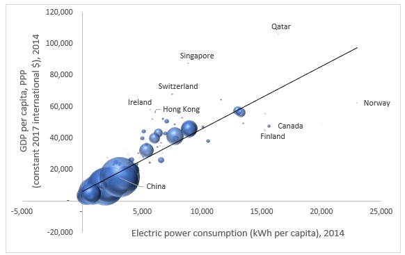
Source: The World Bank’s World Development Indicators: https://data.worldbank.org/indicator/EG.USE.ELEC.KH.PC and https://data.worldbank.org/indicator/NY.GDP.PCAP.PP.KD
Qatar, Singapore, Switzerland, Hong Kong, and Ireland stand out in Figure 1 as having above average GDP/kWh ratios, but the countries with the highest ratios are actually found among the relatively poor countries hidden behind the big bubbles of China and India. Figure 2 shows the same data as Figure 1, but in a way that highlights the differences between countries with relatively low levels of income. Countries that depend heavily on natural resource extraction and/or subsistence agriculture (like Nigeria, Benin, Congo, and Angola) have much higher GDP/kWh ratios than countries dominated by manufacturing industries (like China, India, and South Korea).
Figure 2: Ratio of GDP/electricity consumption versus GDP per capita by country, 2014.
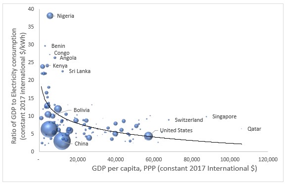
Source: The World Bank’s World Development Indicators: https://data.worldbank.org/indicator/EG.USE.ELEC.KH.PC and https://data.worldbank.org/indicator/NY.GDP.PCAP.PP.KD
These structural characteristics change only slowly, which means that most of the short-to medium-run changes in per capita electricity consumption likely reflect real changes in GDP per capita. These changes can arise either from the supply side (electric equipment making workers more productive), or from the demand side (richer households demanding more electrical appliances, such as refrigerators, washing machines, and TVs), or, more likely, both sides simultaneously. In any case, the correlation between per capita electricity consumption and per capita GDP is extremely strong over time (e.g. 0.995 for Bolivia between 1990 and 2014).
This strong correlation makes electricity consumption a very good proxy for economic development. In the remainder of this article, we will explore within country relationships between electricity consumption and development in Bolivia in 2016, using electricity consumption data from Andersen, Branisa, and Calderón (2019), and we will make extrapolations until 2021 using nighttime lights (NTL) as measured by satellites and presented in NASA’s Black Marble NTL products (Román et al., 2018).
Figure 3 shows a positive, but not particularly strong (r = 0.252), relationship between total per capita electricity consumption in 2016 and the Municipal Index of Sustainable Development (MISD) in Bolivia 2020, which is a multidimensional index of development based on data from 2012-2019 reflecting how close each municipality is to achieve the Sustainable Development Goals (see Andersen et al., 2020). The correlation is relatively weak because some municipalities have modest levels of development despite extremely high levels of electricity consumption. This is mainly because of big cement or mining companies consuming large quantities of electricity to produce products for export (or for national consumption), but without having much positive impact on the local population. The mining company in Antequera, for example, uses almost as much electricity every year as Bolivia’s second biggest city (El Alto with 1 million inhabitants). However, Antequera has less than 4.000 inhabitants and reaches an IMDS value well below the national average.
Figure 3: Per capita electricity consumption versus the Municipal Index of Sustainable Development by municipality in Bolivia, 2016
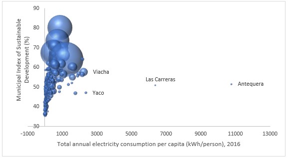
Source: Authors’ elaboration based on Andersen, Branisa and Calderón (2019) and Andersen et al. (2020).
A much stronger relationship between electricity consumption and sustainable development can be found if we include only residential electricity consumption. In that case, the correlation increases to r = 0.666 (see Figure 4). Porongo is an extreme outlier, because it is a relatively rural municipality but with a very affluent neighborhood (Urubó) right next to Santa Cruz de la Sierra. If that one outlier is deleted from the sample, the correlation increases to r = 0.753, which suggests that residential electricity consumption is generally a very good proxy for development.
As in the cross-country case, there are some structural factors that make municipalities systematically deviate from the trendline. Santa Cruz de la Sierra and neighboring municipalities in the lowlands (e.g. Porongo and La Guardia) are not as efficient in achieving the SDGs as cities in the highlands (e.g. La Paz, El Alto, Oruro, and Potosí) and valleys (e.g. Cochabamba and Tarija). That is likely due to the hot climate in the lowlands demanding a lot of air-conditioning.
Figure 4: Per capita residential electricity consumption versus the Municipal Index of Sustainable Development, by municipality in Bolivia, 2016.
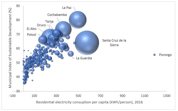
Source: Authors’ elaboration based on Andersen, Branisa, and Calderón (2019) and Andersen et al. (2020).
Residential electricity consumption data is not widely available; however, much-used proxy is nighttime lights (NTL) as measured by satellites. One example is NASA’s Black Marble nighttime lights product suite (Román et al., 2018). Figure 5 shows the NTL data for Bolivia in 2016, the advantages of using NTL radiance are the high spatial resolution (500 meters) and temporal resolution (monthly), as well as the global coverage.
NTL data mainly reflects street lights and other highly visible parts of electricity consumption; although washing machines, refrigerators, radios, cellphones and other electrical appliances that directly enhance the quality of life of the population are invisible to the satellite. The correlation between NTL radiance and electricity consumption for public illumination across municipalities in 2016 is r = 0.980, which is extremely high. The correlation between NTL and residential electricity consumption is a bit lower at r = 0.914, but it is still a very good approximation of total human flourishing in each municipality.
Figure 5: Nighttime light radiance in Bolivia, 2016, according to Black Marble.
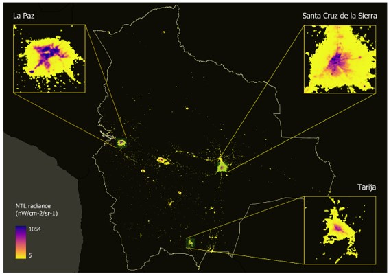
Source: Authors’ elaboration based on NASA’s Black Marble nightlight product suite.
Figure 6 shows the evolution in NTL for all of Bolivia for the period 2012 to 2021 (the period for which the Black Marble data is available) compared to the evolution of real GDP according to the National Statistical Institute (INE). The nightlight intensity increased a bit faster than GDP between 2012 and 2016 and a bit slower between 2016 and 2019, but both show a significant drop due to the pandemic in 2020 and a partial recuperation in 2021.
Figure 6: Evolution of total NTL and real GDP in Bolivia, 2012-2021.
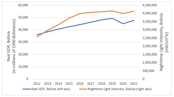
Source: Authors’ elaboration based on data from NASA’s Black Marble and INE.
Neither NTL nor GDP is a perfect measure of human flourishing, but both are positively correlated with what we are really interested in. This means that we can use changes in NTL over time to identify the regions that have experienced most human flourishing over the last decade.
Changes in NTL over time can reflect either increases in population size or increases in development, but given that people tend to migrate to locations with better opportunities, it likely reflects a combination of both.
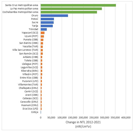
Figure 7 shows the 50 municipalities with the largest increases in NTL intensity between 2012 and 2021. The data suggests that by far the biggest increases in human flourishing are observed in the three metropolitan areas of Santa Cruz,[1] La Paz,[2] and Cochabamba.[3] They are followed by five other departmental capitals (Oruro, Potosí, Sucre, Tarija, and Trinidad).
The increases outside the main cities are much smaller, but worth highlighting. Among the 23 most dynamic municipalities outside the main cities are six from Cochabamba (Punata, San Benito, Arbieto, Tolata, Entre Ríos, and Arani), five from Santa Cruz (Yapacaní, San Ramón, Lagunillas, Camiri, and Cabezas), three from Potosí (Uyuni, Llallagua, and Villazón), three from Tarija (Yacuiba, Villa San Lorenzo, and Villamontes), three from Oruro (Challapata, Caracollo, and Huanuni), two from La Paz (Pucarani and Sica Sica), and one from Beni (Riberalta). The capital of Pando, Cobija, has seen little improvement between 2012 and 2021, but 259 other municipalities experienced even less progress (out of a total of 339 municipalities in the country).
Figure 7: The 50 municipalities with the largest increases in nightlight intensity between 2012 and 2021
Source: Authors’ elaboration based on data from NASA’s Black Marble NTL product suite.
There are different factors that can explain these results, but it seems quite clear that the most populated municipalities (metropolitan areas and departmental capitals) are the most attractive. Undoubtedly, the more populated a municipality is, the greater the possibility of access to services such as education or health, and perhaps more importantly, there are greater opportunities to find work.
However, there are other municipalities with interesting dynamics (some medium-sized cities) that we must study. It is possible that the main economic activities of the country explain these results (such as mining in LLallagua and Huanuni, gas production in Yacuiba and Villamontes, agriculture in Yapacaní, and tourism in Uyuni). The rest of the municipalities on the list should be analyzed in more detail and, perhaps, they will show us some less evident trends in population movements.
[1] The metropolitan area of Santa Cruz includes the following 6 municipalities: Santa Cruz de la Sierra, La Guardia, Warnes, Cotoca, El Torno, and Porongo.
[2] The metropolitan area of La Paz includes the following 8 municipalities: Nuestra Señora de La Paz, El Alto, Viacha, Achocalla, Palca, Laja, Pucarani y Mecapaca.
[3] The metropolitan area of Cochabamba includes the following seven municipalities: Cochabamba, Colcapirhua, Quillacollo, Sacaba, Sipe Sipe, Tiquipaya, and Vinto.
References:
Andersen, L. E., B. Branisa & F. Calderón (2019) “Estimaciones del PIB per cápita y de la actividad económica a nivel municipal en Bolivia en base a datos de consumo de electricidad.” Investigación ganadora presentada al Centro de Investigaciones Sociales (CIS) de la Vicepresidencia del Estado Plurinacional de Bolivia. Mayo.
Andersen, L. E., Canelas, S., Gonzales, A., Peñaranda, L. (2020). Atlas municipal de los Objetivos de Desarrollo Sostenible en Bolivia 2020. La Paz: Universidad Privada Boliviana, SDSN Bolivia. https://sdsnbolivia.org/atlas/
Román, M. O., Wang, Z., Sun, Q., Kalb, V., Miller, S. D., Molthan, A., Schultz, L., Bell, J., Stokes, E. C., Pandey, B., Seto, K. C., Hall, D., Oda, T., Wolfe, R. E., Lin, G., Golpayegani, N., Devadiga, S., Davidson, C., Sarkar, S., … Masuoka, E. J. (2018). NASA’s Black Marble nighttime lights product suite. Remote Sensing of Environment, 210, 113–143. https://doi.org/10.1016/j.rse.2018.03.017
This blog is part of the project INEQUALITREES – A Novel Look at Socio-Economic Inequalities using Machine Learning Techniques and Integrated Data Sources. For more information, please visit the project web-site: https://inequalitrees.eu/